Image – https://100covers.com/?ref=4
A great book cover is still the single most important marketing tool you have as an author especially in a crowded, algorithm-driven marketplace. Whether readers are browsing in a bookstore or scrolling through thumbnail search results on Amazon and other retailers, your cover must stop the scroll, communicate your genre instantly, and convert curious browsers into buyers.
In 2026, cover design is more strategic than ever blending classic design principles, digital-first optimization, and genre signals shaped by BookTok, Bookstagram, and global bestseller shelves. Here’s how to design a cover that looks professional, sells more books, and stands the test of time.
Why Your Book Cover Matters More in 2026
Before we dig into the steps, let’s set the stage:
Readers judge books by their covers. A compelling cover isn’t “nice to have” it’s a business driver.
Thumbnail effectiveness is essential. Most book buying starts on a device so your cover must read clearly at tiny sizes.
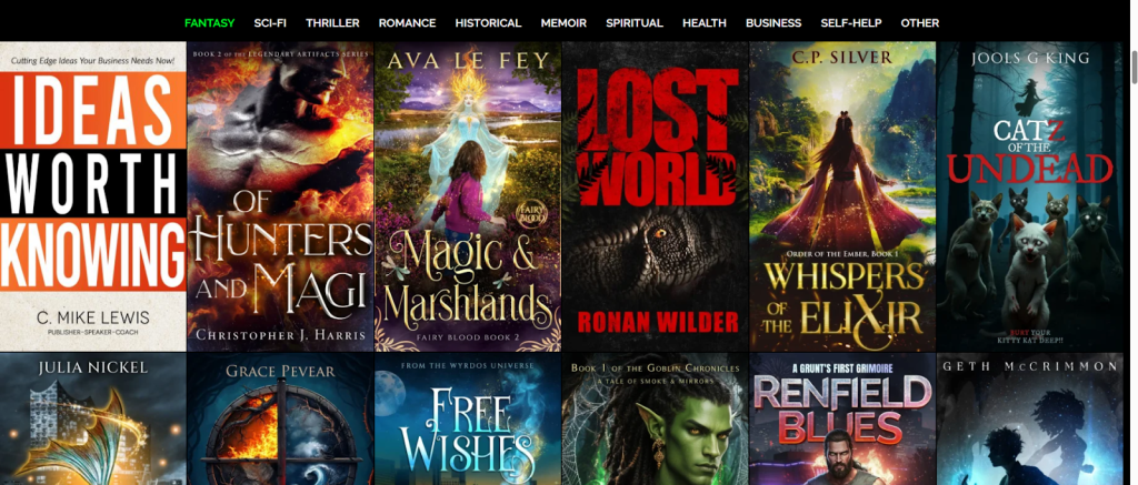
Genre expectations matter. Readers rely on visual cues colors, imagery, and typography to instantly recognize genre.
Trends evolve fast. Today’s covers blend minimalism with bold typography, mixed-media collage, and unexpected color contrasts.
Step 1 -Know Your Genre & Audience
Before colors, fonts, or images:
Ask yourself:
Who is your ideal reader?
What covers are already selling in your niche?
What visual signals do readers expect?
Genre conventions work like shorthand a mystery novel signals suspense with dark shadows and big typography, while literary fiction might use minimal imagery and poetic type.
Pro Tip: Browse bestsellers in your category and take visual notes, but don’t copy. Aim to stand out within the conversation.
Step 2 -Start with Research & Inspiration
Look at a mix of styles that work:
Bestsellers in your category
Recent award winners
Covers that grab your attention even as thumbnails
Websites like 99designs’ book cover gallery are great for visual inspiration.
Create a mood board with:
Color palettes
Imagery styles
Typography combinations
This will guide you when you start designing.
Step 3 -Pick the Right Tool
You’ve got options depending on skill and budget:
🛠 Free/Easy Tools
Canva — ideal for beginners with thousands of templates.
BookBrush — built for authors with built-in templates.
💻 Pro Tools
Adobe Photoshop or Illustrator — gives full creative control.
Figma — great for layout experimentation.
Choose what fits your workflow — great ideas matter more than the software.
🎨 Step 4 — Build Your Cover Layout
Every cover has these core elements:
Title & Subtitle
Author Name
Main Imagery or Graphic
Color Palette
Typography Choice
Here’s how to balance them:
📌 Hierarchy First
Use size and placement to tell the eye where to start. The title should be most visible especially in thumbnails.
🖼 Imagery
Your main image should communicate mood and genre but keep it simple and meaningful. Too much detail can blur in thumbnail views.
🎨 Color
Color psychology matters warm tones can evoke emotion, dark palettes can set suspense, and bold contrasts catch the eye.
Typography Trends in 2026
2026 is all about expressive, character-rich type. Think:
Serif with personality for literary works
Oversized headlines for thrillers
Neo-Deco inspired titles for premium nonfiction
Playful, expressive fonts for YA and romance
These trends emphasize emotion and genre signaling.
Step 5 — Embrace 2026 Design Trends
Staying current helps your book feel like part of the contemporary literary conversation:
🌟 Bold Typography
Dominant, oversized type makes your title unmissable even as a tiny thumbnail.
✂️ Collage & Mixed Media
Blending photos, graphics, and textures adds depth and originality to covers.
🔷 Geometry & Bold Shapes
Clean lines and structure add modern flair and help guide the reader’s eye.
✨ Tactile Details
Embossing, metallic finishes, and subtle grain can make the physical book feel premium.
Trend-aware design doesn’t mean following blind fashion — it means enhancing genre signals thoughtfully.
Step 6 — Test Your Cover Like a Pro
Before finalizing:
📌 Thumbnail Test
View your cover at tiny sizes if it reads as “What is this?” it’s too complex.
👀 Audience Feedback
Share mockups with your target readers ask what genre they think the cover represents. If it matches your intent, you’re on track.
Professional Input
If design isn’t your strength, consider hiring a pro your cover is the first impression anyone will have of your book.
Step 7 – Export & Upload for Publishing
Whether you’re self-publishing on Amazon KDP or designing for print, make sure you:
Use the correct trim size and bleed
Embed fonts
Save in the highest quality format (PDF for print, PNG/JPEG for ebook)
Check spine and back cover details if printing a paperback or hardcover.
📘 Final Principles of Great Cover Design
✔ Tell one story, simply and clearly
✔ Match reader expectations for genre
✔ Make it memorable, not generic
✔ Optimize for both digital and physical formats, A strong cover doesn’t just look good — it sells your book. With the right research, tools, and 2026 design sensibility, you can create a cover that helps your book succeed.
Leave a Reply