Formatting a children’s book correctly is one of the most important steps in the publishing process. A well-formatted book not only looks professional, but it also makes reading easier and more enjoyable for kids and caregivers. In 2026, standards for children’s books have continued to evolve, especially with the growth of digital reading devices, interactive apps, and print-on-demand services.
This guide walks you through everything you need to know, from structural basics to platform requirements and best practices for both print and ebook versions.
Understanding the Purpose of Book Formatting
Before you start formatting, it helps to be clear about why it matters.
A properly formatted children’s book:
- Improves readability for young readers by controlling spacing, font size, and image placement.
- Ensures illustrations and text work together in harmony.
- Meets technical requirements for platforms like Amazon Kindle Direct Publishing, IngramSpark, Apple Books, and interactive children’s reading apps.
- Helps establish your brand as an author and builds trust with parents, teachers, and librarians.
Key Differences in Children’s Book Formatting
Children’s books are not formatted the same way as adult novels. Here are the major differences:
Text and Image Integration
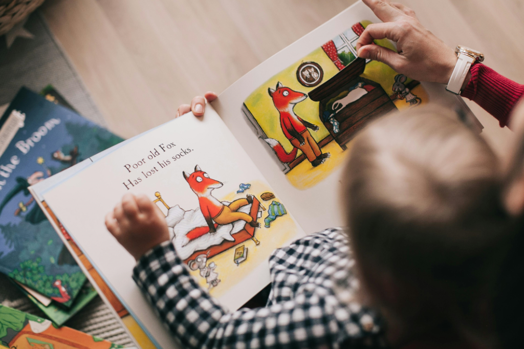
Children’s books rely heavily on visuals. Illustrations are not just decorations; they often carry the narrative. That means:
- Text must flow around images naturally.
- Images should be high resolution so they remain crisp in print and on tablet screens.
- Placement matters. The eye path of young readers should not be disrupted by poorly aligned pages or awkward spacing.
Font and Size
Choosing the right font and size is crucial. Young readers need:
- Larger fonts than those used in adult books.
- Clear, readable typefaces without complex decorative elements.
- Consistency throughout the book.
Pacing and Page Turns
Children’s books often use page turns as narrative beats. Formatting should support this by:
- Positioning text and illustrations so the reader’s attention falls on the right place as they turn the page.
- Avoiding text that splits awkwardly across a page turn.
Step-by-Step Guide to Formatting Your Children’s Book
Step 1: Decide on Your Book Format
Children’s books are typically published as:
- Print paperback or hardcover
- Ebook
- Interactive digital books (enhanced EPUB or fixed layout)
Your formatting approach depends on this choice. Print and fixed layout ebooks require precise control over placement, while reflowable ebooks allow text to adapt to screen size.
Step 2: Set Up Your Document
Start with the correct page size for your print edition. Common sizes include:
- 8.5 x 8.5 inches
- 8 x 10 inches
- 9 x 12 inches
Consistency is important. All pages should be the same size, and margins should allow enough space around text and illustrations.
In your formatting software, define:
- Page size
- Margins
- Header and footer settings
- Pagination style
Step 3: Work With Illustrations
Illustrations are often the heart of a children’s book, so they require special attention:
Image Quality
Use images that are at least 300 dots per inch (DPI) for print. Lower quality images may look blurry or pixelated.
Placement
Choose one of these approaches depending on narrative needs:
- Full-page illustration on one side and text on the opposite page
- Text overlaid on images (with sufficient contrast)
- Integrated spreads where illustrations continue across two pages
Aspect Ratios
Maintain a consistent aspect ratio for similar illustrations so the book feels visually cohesive.
Step 4: Choose Appropriate Fonts and Sizes
Select fonts that are easy to read and age-appropriate. Avoid overly stylized or handwritten fonts that can confuse early readers.
Font Size Guidelines
Different age ranges benefit from different font sizes:
- Early readers: 18–22 point minimum
- Middle grade read-aloud books: 16–20 point
- Picture books: 22–28 point
Leading (line spacing) should be generous so text doesn’t feel cramped.
Step 5: Add Page Numbers and Running Headers
Page numbers help guide readers in print formats. Children’s books often choose:
- Bottom center placement
- Slightly larger numbers than adult books
Running headers (like author name or book title) are optional but can help with navigation in longer books.
Step 6: Create a Table of Contents
Many children’s books include a simple table of contents, especially if the book is chapter-based. Make sure the table of contents:
- Uses accurate page numbers
- Matches the page numbering style in the rest of the book
Step 7: Review for Digital Formats
If you plan to release an ebook version, formatting for digital devices is essential. There are two common ebook approaches:
Reflowable EPUB
Text adapts to screen size, ideal for chapter books.
Fixed Layout EPUB
Fixed design that preserves page layout, important for picture books.
2026 Tip
Enhanced EPUB options now support interactive elements like clickable pronunciation guides, definitions, and simple animations that can improve reading engagement for younger children.
Step 8: Test Your Files
Before publishing, test all formats:
- Print proof (physical copy)
- Ebook preview on multiple devices
- Interactive ebook preview
Check for:
- Image clarity
- Text alignment
- Legibility on small screens
- Correct pagination
Platform Requirements You Should Know
Different publishing platforms have specific requirements. Learn them early to avoid costly rework.
Kindle Direct Publishing
- Supports fixed and reflowable layouts
- Fixed layout is recommended for picture books
- Images must meet size and quality standards
IngramSpark
- Excellent option for global print distribution
- Requires PDF/X-1a files with embedded fonts
Apple Books
- Supports enhanced EPUB
- Great for interactive children’s books
2026 Publishing Update
Newer platform features include controlled page swipes that simulate real book page turns, sound enhancements, and optional audio narration embedded directly into the EPUB.
Common Formatting Mistakes to Avoid
Do not:
- Use fonts smaller than recommended minimums
- Rely on low-resolution artwork
- Place text too close to margins
- Ignore platform specifications
- Assume print and ebooks can use the same layout without changes
Final Checklist Before Publishing
Before you upload, verify:
- All images are high resolution
- Fonts are embedded
- Page size and margins are correct
- Page numbers are consistent
- Your ebook displays correctly on real devices
- Your print proof matches expectations
Conclusion
Formatting a children’s book in 2026 requires attention to visual clarity, narrative pacing, technical specification, and audience needs. Whether you are self-publishing or working with a designer, the right formatting approach enhances storytelling and improves reader experience. By following these steps, you will create a professional, polished book that children will enjoy and parents will appreciate.
Leave a Reply